JobCracker
Understand the role before you invest in the application.
The recording above is the extension running on a demo posting with sample candidate data.
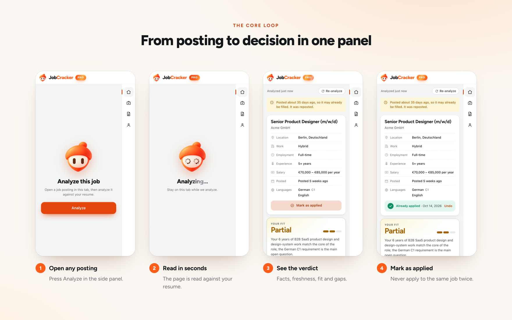
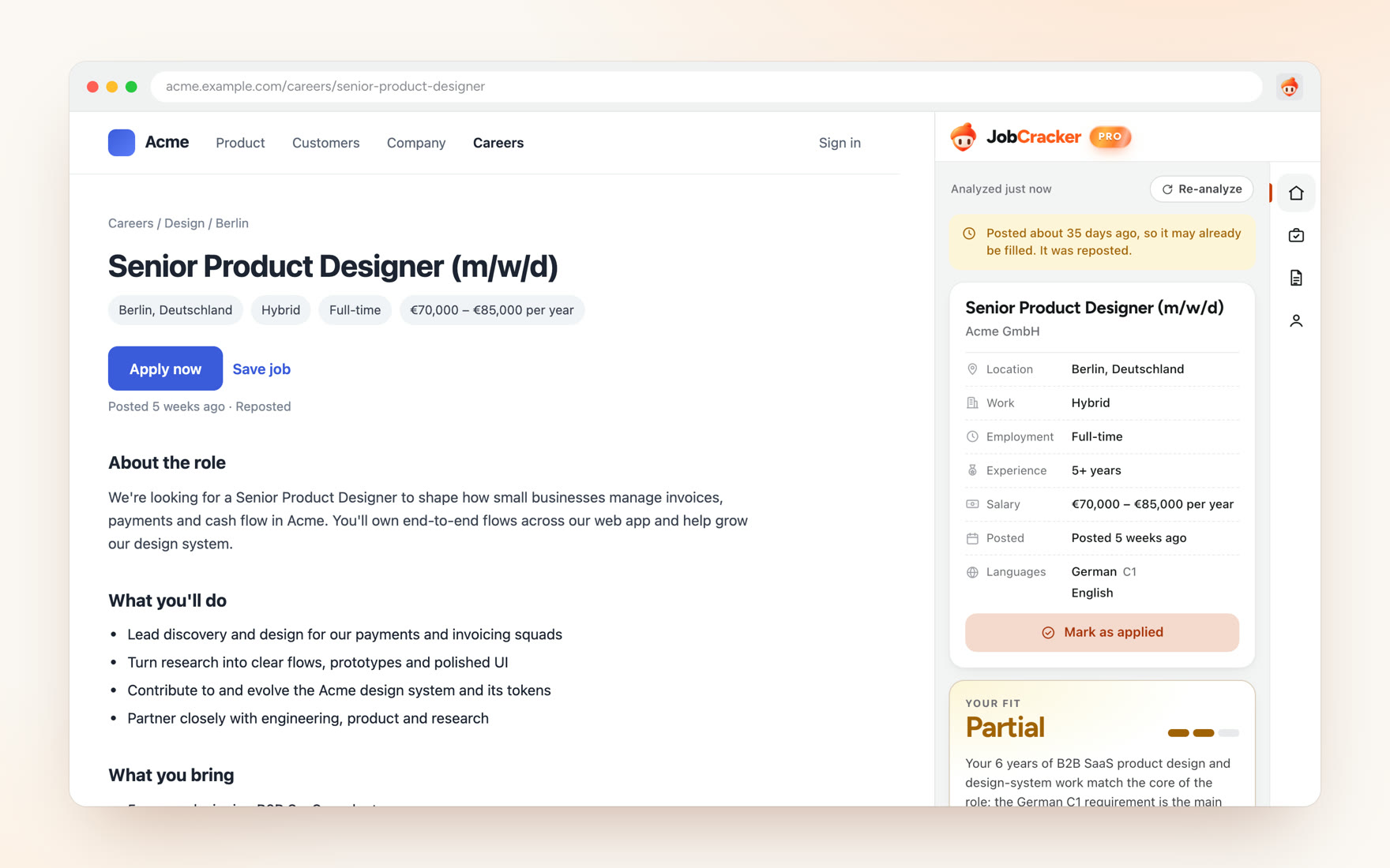
JobCracker is a Chrome extension for people deciding whether a job deserves their time. It reads a posting, compares it with the candidate’s background, and shows strengths, gaps and things worth checking.
The design problem is making an AI assessment useful without letting it pass for a hiring prediction.
The problem: deciding before applying
The hard question comes before the application. What does this role actually require, and does my background support it?
My research kept surfacing uncertainty about requirements, about fit, and about whether an application was worth the effort. These were recurring themes in a small evidence set, not findings about job seekers in general.
- Understand the role
Separate what the posting requires from what it only suggests. Spot vague or inflated requirements.
- Compare it with my background
See where my experience supports the role and where it doesn’t, before writing anything.
Distrust of stale or “ghost” listings came up too. I treat it as context. The text of a posting can’t show whether a role is really being filled, so the product can’t resolve it.
Discovery: people already do this with AI
This is where the research changed the project.
Some job seekers already paste a posting and their résumé into ChatGPT, Claude or Gemini. Some keep reusable prompts and their own score thresholds for deciding whether to apply. The core comparison wasn’t new, and the evidence didn’t show that copy-pasting was the pain they most wanted fixed.
Existing workaround
- Find job
- Copy posting
- Supply background
- Prompt general AI
- Inspect result
- Decide
JobCracker concept
- Open job
- Analyse in browser
- Inspect matches, gaps, evidence
- Decide
“A browser extension” wasn’t a reason to exist. The question changed from can I compare these two documents? to can the output earn trust and change a real decision?
The turning point: evidence before confidence
On 2 October I stopped broad market research and moved to a small experiment built around real apply-or-skip decisions.
What people said about AI fit scores pointed in one direction: scores felt inconsistent, inflated, and came with reasoning they couldn’t follow. Much of that evidence was about résumé scoring tools rather than decisions about a specific job, so I treat it as a direction, not a finding.
- Earlier framing Job + résumé → match result
One comparison, one answer.
- Reframed direction Requirement + candidate evidence → match / gap / unknown → your decision
Every conclusion points to the requirement and the evidence behind it.
The direction became inspectable evidence: show which requirement supports each conclusion, tell apart a skill the person lacks from one their résumé doesn’t mention, and make uncertainty visible.
Decisions
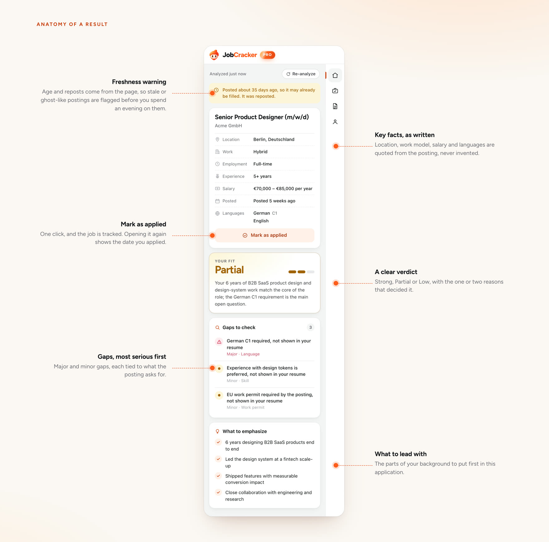
01 · Keep job facts apart from the AI’s reading of them
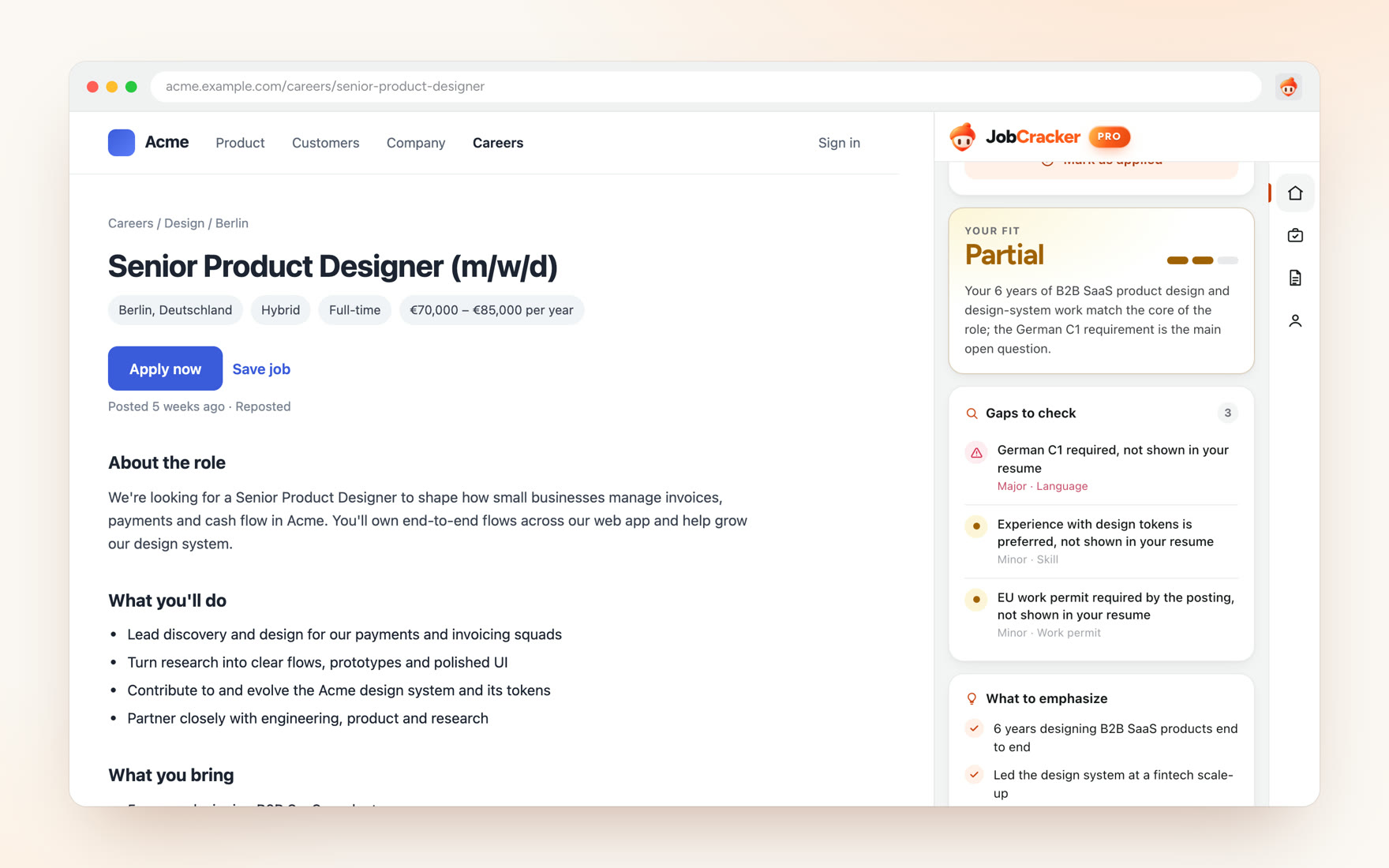
What the posting states (location, work mode, experience, salary, languages, posting date) is listed separately from the fit assessment. Age and reposting appear as a note to check, not as a verdict on the job.
In the extension, the facts are quoted from the posting rather than summarised, and the listing’s age is worked out from the dates on the page, not estimated by the model.
- Rejected
- Positioning JobCracker as a ghost-job detector. It would have been an easy hook, but posting text can't support the claim.
- What it cost
- A weaker headline. A note that says “check this” is less satisfying than a red flag.
02 · Show the gaps, and say why each one is a gap
In the extension, the fit summary sits directly above a short list of prioritised gaps, each written as a specific requirement. A requirement the résumé doesn’t mention is labelled “not shown in your resume”. It is something to verify, not proof the person can’t do it.
- Rejected
- A single ranked list of strengths and weaknesses, which reads faster but merges “doesn't have it” with “didn't write it down”.
- What it cost
- More words in a narrow side panel, and an answer that sounds less sure of itself.
03 · No false precision
The model only sees the posting and the background the person gives it. It can’t know an employer’s screening rules, what the hiring manager wants, or whether the role is still open. The interface has to say so rather than hide it.
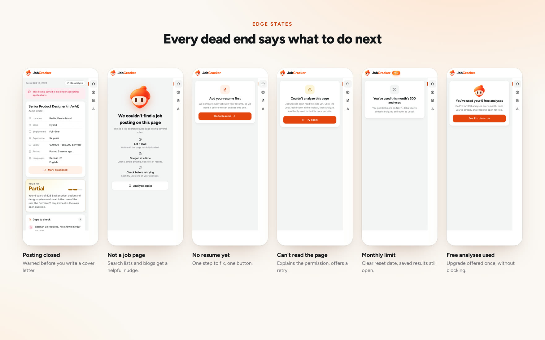
The extension expresses fit as a word and a three-step bar, not a percentage. Unknowns are stated outright, and so are the cases where it can’t help: a closed posting, a page that isn’t a job, a site it can’t read. The architecture splits the work: AI handles semantic understanding, and deterministic code handles validation, scoring, history, credits and rules.
AI
- Read posting
- Interpret requirements
- Relate them to supplied background
Deterministic code
- Validate output
- Score
- Store history
- Apply credits and rules
- Rejected
- A numeric match score. People already use them, and they're easy to compare across jobs.
- What it cost
- No single number to sort by. That is a real convenience loss for anyone comparing many roles.
Tracking applications
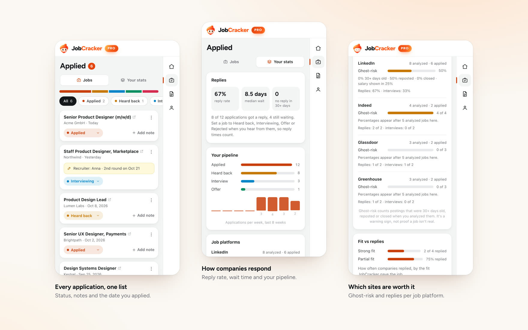
Once a job is marked as applied, the tracker keeps its status, notes and the date. Opening the same posting again shows that you already applied, with an undo.
-
Mark as applied
-
Add a note
-
Status to stats
Turning a tracker into insight
The statuses people set feed a stats view: reply rate, median wait, a pipeline from applied to offer, and how each job platform’s postings have behaved. Everything is calculated from the person’s own analyses and applications, and percentages stay hidden until there are enough analysed jobs to mean something. Ghost-risk counts postings that were old, reposted or closed when analysed, and the panel says it’s a warning sign, not proof a job isn’t real.
Light and dark
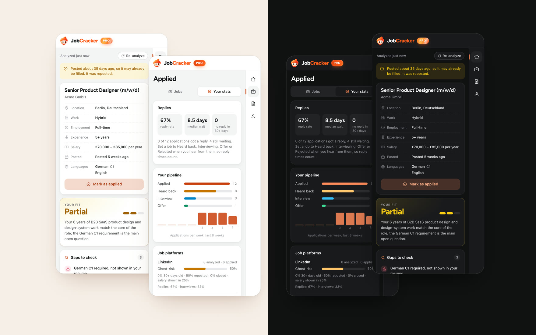
The side panel sits next to any website, so it has a light and a dark theme. People can pick one in the profile, or follow the system setting.
-
Switching theme
-
Analysing in dark
-
Tracker in dark
Identity
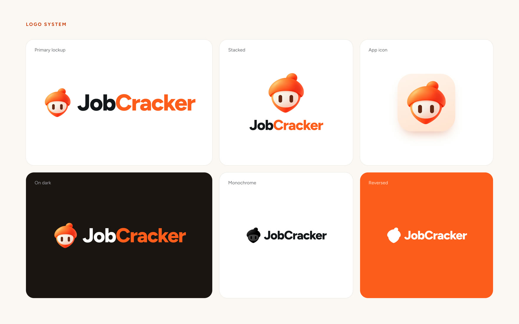
The mascot is an orange acorn, chosen on 5 October to replace an earlier flying squirrel. The early explorations were made with AI image tools, then refined into the production mascot.
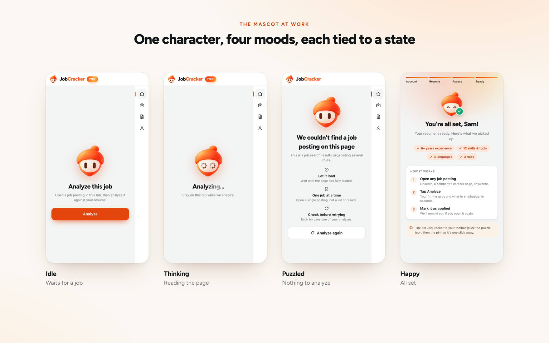
I explored fifteen expressions and kept four, each tied to a state in the product: idle while it waits, thinking while a posting is analysed, puzzled when there’s nothing to read, and happy when you apply or finish setting up. None of them reacts to a fit result, because a good match isn’t a job offer. It’s built in layers, so it blinks, follows the pointer, and its eyes double as the loading indicator.